📌Flex box
행과 열 형태로 자식 요소를 배치하는 레이아웃 속성. 부모 요소 내부에 포함된 자식 요소들을 세로, 가로 중심부에 정렬하거나, 자식 요소의 너비를 동일하게 설정할 수 있다.
📌속성
<body>
    <div class="wrap">
        <div class="parent">
            <div class="child"></div>
            <div class="child"></div>
            <div class="child"></div>
        </div>

    </div>
</body>
html, body{
margin : 0;
padding: 0;
}
.parent{
width: 500px;
height: 600px;
background-color: pink;
display: flex;
flex-direction: column;
align-items: center;
}
.child{
width: 100px;
height: 100px;
border: 1px solid #000;
background-color: wheat;
}

flex-direction
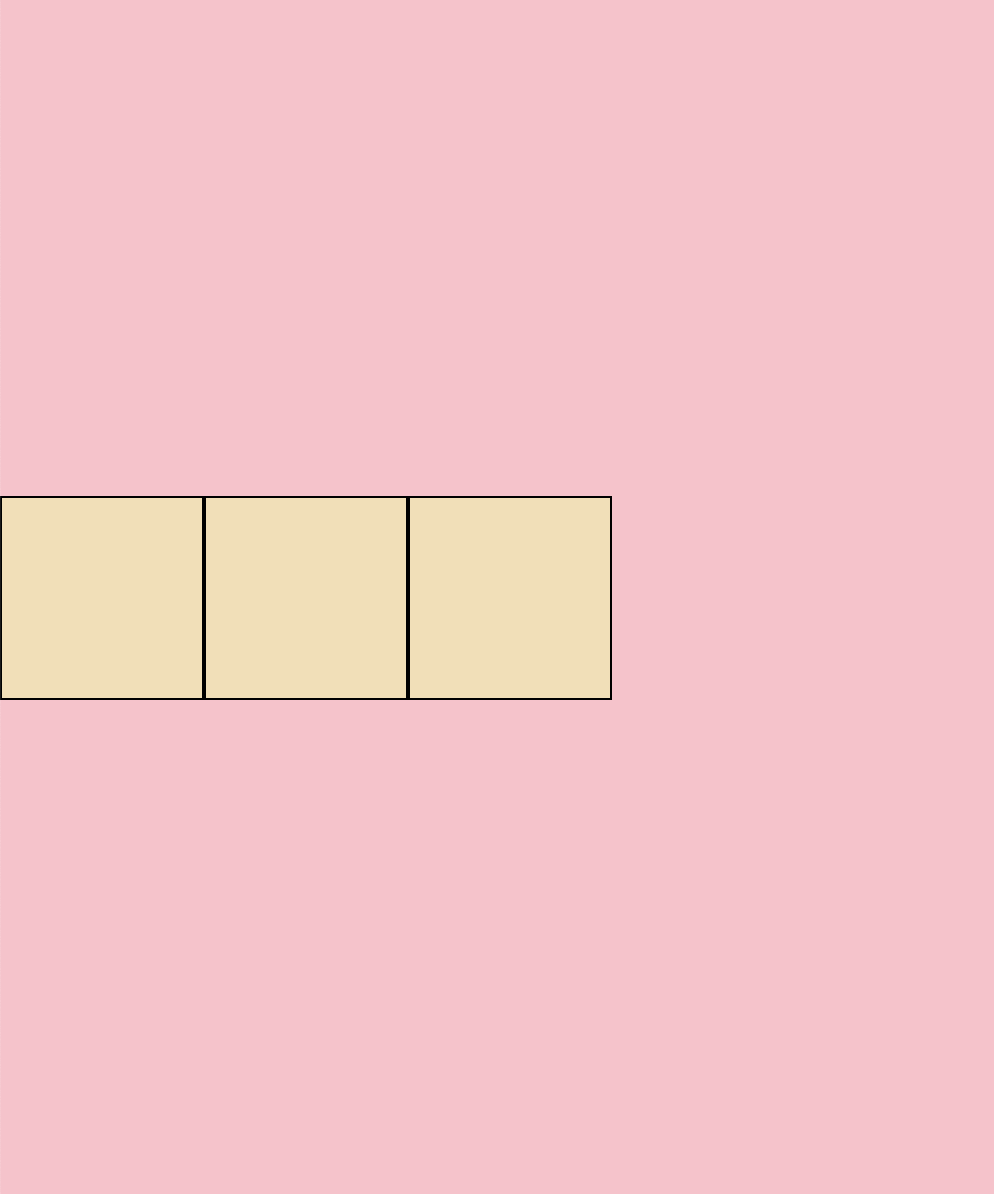
위와 같이 부모 요소 내에 여러 자식 요소가 있을 때, 스타일에 `display: flex` 를 작성하면 flex box로 요소를 다룰 수 있다.
기본적으로 자식 요소가 가로로 정렬된다.
`flex-direction` 을 열 또는 행 방향으로 설정할 수 있다. 기본 값은 `flex-direction: row`으로 속성값을 작성하지 않으면 열 방향으로 설정된다.
.parent{
    width: 500px;
    height: 600px;
    background-color: pink;
    display: flex;

}


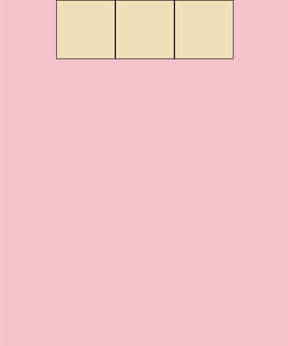
align-items
현재 flex-box의 방향이 열(row)로 되어있으므로, `align-items: center` 를 적용하면 수직 정렬할 수 있다.
.parent{
    width: 500px;
    height: 600px;
    background-color: pink;

    display: flex;
    align-items: center;

}
현재 방향이 열(row)이므로, `align-item : flex-end`를 설정하면 부모 요소의 가장 끝단에 배치할 수 있다.
기본값은 `flex-start` (상단 고정)
.parent{
    width: 500px;
    height: 600px;
    background-color: pink;

    display: flex;
    align-items: flex-end;
}

justify-content
현재 flex-box 방향이 열(row)로 되어있으므로, `justify-content: center` 를 적용하면 수평 정렬할 수 있다.
.parent{
    width: 500px;
    height: 600px;
    background-color: pink;

    display: flex;
    justify-content: center;
}
현재 방향이 열(row)이므로, `justify : flex-end`를 설정하면 부모 요소의 가장 끝단에 배치할 수 있다.
기본값은 `flex-start` (상단 고정)
.parent{
    width: 500px;
    height: 600px;
    background-color: pink;

    display: flex;
    justify-content: flex-end;
}

현재 방향이 열(row)이므로, `justify-content: space-around;`를 작성하면 부모 요소에 맞춰 좌우 마진을 동일하게 설정한다.
.parent{
    width: 500px;
    height: 600px;
    background-color: pink;

    display: flex;
    justify-content: space-around;
}

현재 방향이 열(row)이므로, `justify-content: space-between;`를 작성하면 요소 사이의 좌우 공간을 동일하게 배치한다. 단, 맨 처음 요소와 마지막 요소는 마진 없이 딱 붙인다.
.parent{
    width: 500px;
    height: 600px;
    background-color: pink;

    display: flex;
    justify-content: space-between;
}

현재 방향이 열(row)이므로, `justify-content: space-around;` 를 작성하면 요소 사이의 공간을 동일하게 배치한다. 이때 `justify-content: space-between;`와 달리 맨 첫 요소와 마지막 요소의 좌우 여백도 동일한 공간으로 맞춘다.
.parent{
    width: 500px;
    height: 600px;
    background-color: pink;

    display: flex;
    justify-content: space-around;
}

'HTML, CSS' 카테고리의 다른 글
| [HTML/CSS] 자주 쓰는 태그/스타일 (0) | 2024.10.17 |
|---|